Hi Janice,
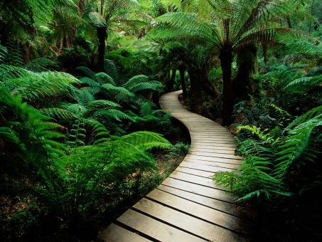
I think that I am on your correct post for the graphic design post/blog. To start off, my first critical suggestion is to add the blog portion of the assignment. I really enjoy your image, I am just unsure what you are wanting to portray/say with the picture. The blog portion of the assignment would really give myself and others insight as to what you are wanting to show. Based off of your image collection post, you mentioned you wanted to do a brochure of Australia! I like this concept. My next critical suggestion is to make your graphic design similar to a brochure. I would look at the examples for assignment details, there are many cool designs shown. I would also look up brochures to get a cool idea for a design. I do like the overall image that you posted. I am not sure if you intended for it too look blurry-ish, but I think it goes well with how dark it is. I think that it would be cool if you were to add text and imagery of the animals you used for your image collection. Good job, I would for sure get the blog portion posted, even if it doesn’t count for a grade due to it being late.
Hello Logan. After viewing your graphic design draft, I am encouraged. I love your draft period. I like how you explained the process to get the results you posted. I love the images of your dog and the captions. The color is excellent. It’s bright, and it speaks to you in a way that warms your heart. I know we’re to write at least 150 words, but I see nothing you can improve on. Thank you for your feedback as well. If you have not noticed, I have no idea what I am doing. I am learning as I go. Again did a great job. You can’t improve perfection, and your draft is perfect in my opinion. I will try to improve my draft by following the step you used. If you are not knowledgeable with photoshop, you can’t tell. Your Design looks very professional
For your brochure, I would consider looking online for other examples. I find this gives me inspiration enough to adapt my own ideas to standard formats. I would love to see facts about the area you visited or would like to visit.
With your prior experiences in parks and other natural settings, you can include nice ones to go to. This would give the reader the information required to trust your recommendations.
I like the animals you have photos of, but I think if they were unencumbered by the fence it would be more pleasant for the viewer. You can find free photos many different places. I personally used https://pixabay.com for some of mine.
They have wonderful photos all for free and they can give your brochure a brilliant boost of energy.
Hello Morgan,
I like your graphic design draft. It apperars you know what you’re doing. Your use of color in the draft is strong. The photo movement when you point on the draft is a nice bonus feature. I not good at photoshop at all but what I do see is a great start. Your comments help tell how you see life and what you expect for yourself in the feature adds to your vision of this draft. What I do suggest are the colors be more vivid. I couldn’t read the words in white toward the bottom of the image as well as I could on the top portion of your draft. I don’t know if changing the color of the words at the bottom would help but play with it and see what you think. Overall I don’t see many changes that needed just a little color adjustment. I can’t wait to see the final version.
A travel brochure seems like a very interesting idea for a project. I think the photo of the Sydney Opera House you have selected will serve well as an image to center the brochure around. The opera house is such a recognizable landmark, a viewer can immediately relate it to Australia.
As for feedback, I echo what Morgan said. The photos you have included here might be difficult to incorporate naturally into a brochure without some real heavy duty photoshopping. You could make the brochure about a zoo in Australia. That would make the photos make more sense with the visual fences.
I would also suggest brightening up the photo of the Sydney Opera House. It is a bit dark and moody in contrast to the bright and lively feel travel brochures tend to have. You could also bump up the saturation a bit on that photo as well.
Hi Lucas, Your Graphic design is bright yet inviting. The colors you chose are sufficient for the mood you are setting. Your blog also provides and exciting insight into the vision of your draft. The presentation is strong. I see nothing to improve in my opinion, Lovely job. I also welcome your comments on my selection. I have a lot to learn in a short amount of time. I know nothing about Photoshop and trying to catch up to the class. Thank you for the suggestions to improve my idea.


Hi Janice,
I think that I am on your correct post for the graphic design post/blog. To start off, my first critical suggestion is to add the blog portion of the assignment. I really enjoy your image, I am just unsure what you are wanting to portray/say with the picture. The blog portion of the assignment would really give myself and others insight as to what you are wanting to show. Based off of your image collection post, you mentioned you wanted to do a brochure of Australia! I like this concept. My next critical suggestion is to make your graphic design similar to a brochure. I would look at the examples for assignment details, there are many cool designs shown. I would also look up brochures to get a cool idea for a design. I do like the overall image that you posted. I am not sure if you intended for it too look blurry-ish, but I think it goes well with how dark it is. I think that it would be cool if you were to add text and imagery of the animals you used for your image collection. Good job, I would for sure get the blog portion posted, even if it doesn’t count for a grade due to it being late.
LikeLike
Hello Logan. After viewing your graphic design draft, I am encouraged. I love your draft period. I like how you explained the process to get the results you posted. I love the images of your dog and the captions. The color is excellent. It’s bright, and it speaks to you in a way that warms your heart. I know we’re to write at least 150 words, but I see nothing you can improve on. Thank you for your feedback as well. If you have not noticed, I have no idea what I am doing. I am learning as I go. Again did a great job. You can’t improve perfection, and your draft is perfect in my opinion. I will try to improve my draft by following the step you used. If you are not knowledgeable with photoshop, you can’t tell. Your Design looks very professional
LikeLiked by 1 person
Hello Janice,
For your brochure, I would consider looking online for other examples. I find this gives me inspiration enough to adapt my own ideas to standard formats. I would love to see facts about the area you visited or would like to visit.
With your prior experiences in parks and other natural settings, you can include nice ones to go to. This would give the reader the information required to trust your recommendations.
I like the animals you have photos of, but I think if they were unencumbered by the fence it would be more pleasant for the viewer. You can find free photos many different places. I personally used https://pixabay.com for some of mine.
They have wonderful photos all for free and they can give your brochure a brilliant boost of energy.
Best of luck on the rest of your projects.
Morgan
LikeLike
Hello Morgan,
I like your graphic design draft. It apperars you know what you’re doing. Your use of color in the draft is strong. The photo movement when you point on the draft is a nice bonus feature. I not good at photoshop at all but what I do see is a great start. Your comments help tell how you see life and what you expect for yourself in the feature adds to your vision of this draft. What I do suggest are the colors be more vivid. I couldn’t read the words in white toward the bottom of the image as well as I could on the top portion of your draft. I don’t know if changing the color of the words at the bottom would help but play with it and see what you think. Overall I don’t see many changes that needed just a little color adjustment. I can’t wait to see the final version.
LikeLike
Hi Janice,
A travel brochure seems like a very interesting idea for a project. I think the photo of the Sydney Opera House you have selected will serve well as an image to center the brochure around. The opera house is such a recognizable landmark, a viewer can immediately relate it to Australia.
As for feedback, I echo what Morgan said. The photos you have included here might be difficult to incorporate naturally into a brochure without some real heavy duty photoshopping. You could make the brochure about a zoo in Australia. That would make the photos make more sense with the visual fences.
I would also suggest brightening up the photo of the Sydney Opera House. It is a bit dark and moody in contrast to the bright and lively feel travel brochures tend to have. You could also bump up the saturation a bit on that photo as well.
I look forward to seeing your finished project!
Best,
-LN
LikeLike
Hi Lucas, Your Graphic design is bright yet inviting. The colors you chose are sufficient for the mood you are setting. Your blog also provides and exciting insight into the vision of your draft. The presentation is strong. I see nothing to improve in my opinion, Lovely job. I also welcome your comments on my selection. I have a lot to learn in a short amount of time. I know nothing about Photoshop and trying to catch up to the class. Thank you for the suggestions to improve my idea.
LikeLike